來(lái)源:數(shù)據(jù)STUDIO
作者:云朵君
Pyecharts 是一個(gè)用于生成 Echarts 圖表的類(lèi)庫(kù)。Echarts 是百度開(kāi)源的一個(gè)數(shù)據(jù)可視化 JS 庫(kù)。用 Echarts 生成的圖可視化效果非常棒���,pyecharts 是為了與 Python 進(jìn)行對(duì)接,方便在 Python 中直接使用數(shù)據(jù)生成圖�。
Pyecharts繪制地圖如此輕松,幾行代碼搞定多種形式的數(shù)據(jù)地圖�����。
一�����、安裝
首先需要安裝python第三方包 -- pyecharts��, 目前最新版本為1.8.1����。
pip install pyecharts
自從 v0.3.2 開(kāi)始����,為了縮減項(xiàng)目本身的體積以及維持 pyecharts項(xiàng)目的輕量化運(yùn)行�����,pyecharts將不再自帶地圖 js 文件��。如用戶需要用到地圖圖表�,可自行安裝對(duì)應(yīng)的地圖文件包。下面介紹如何安裝���。
-
全球國(guó)家地圖: echarts-countries-pypkg (1.9MB): 世界地圖和 213 個(gè)國(guó)家����,包括中國(guó)地圖
-
中國(guó)省級(jí)地圖: echarts-china-provinces-pypkg (730KB):23 個(gè)省����,5 個(gè)自治區(qū)
-
中國(guó)市級(jí)地圖: echarts-china-cities-pypkg (3.8MB):370 個(gè)中國(guó)城市
-
中國(guó)縣區(qū)級(jí)地圖: echarts-china-counties-pypkg (4.1MB):2882 個(gè)中國(guó)縣·區(qū)
-
中國(guó)區(qū)域地圖: echarts-china-misc-pypkg (148KB):11 個(gè)中國(guó)區(qū)域地圖�����,比如華南、華北
選擇自己需要安裝地圖相關(guān)的擴(kuò)展包����。
pip install echarts-countries-pypkg
pip install echarts-china-provinces-pypkg
pip install echarts-china-cities-pypkg
pip install echarts-china-counties-pypkg
pip install echarts-china-misc-pypkg
pip install echarts-united-kingdom-pypkg
可以選擇豆瓣源或清華源加速安裝。
pip install pyecharts -i http://pypi.douban.com/simple
pip install -i https://pypi.tuna.tsinghua.edu.cn/simple echarts-countries-pypkg
pyecharts版本 v0.5.x 和 v1 間不兼容��,v1 是一個(gè)全新的版本�����,語(yǔ)法也有很大不同�����。
查看pyecharts版本�。
import pyecharts print(pyecharts.__version__)
做好準(zhǔn)備后,就可以開(kāi)始繪圖了����。如果你是新手,對(duì)pyehcarts還有些陌生��,可以參見(jiàn)官方5分鐘上手:
二�����、繪制地圖
Pyehcarts共有有四種地理圖表,
-
Map:地圖
(https://pyecharts.org/#/zh-cn/geography_charts?id=map:地圖)以此為基礎(chǔ)�����,熟悉繪圖基本步驟及各個(gè)配置項(xiàng)�����。
-
Geo:地理坐標(biāo)系
(https://pyecharts.org/#/zh-cn/geography_charts?id=geo:地理坐標(biāo)系)本文重點(diǎn)介紹
-
BMap:百度地圖
(https://pyecharts.org/#/zh-cn/geography_charts?id=bmap:百度地圖)
百度地圖需要申請(qǐng)開(kāi)發(fā)者 AK�,(https://lbsyun.baidu.com/)。這里不做細(xì)說(shuō)��,大家有興趣可以去pyecharts官網(wǎng)學(xué)習(xí)�����。
-
Map3D:三維地圖 (https://pyecharts.org/#/zh-cn/3d_charts?id=map3d-三維地圖)
一���、Map
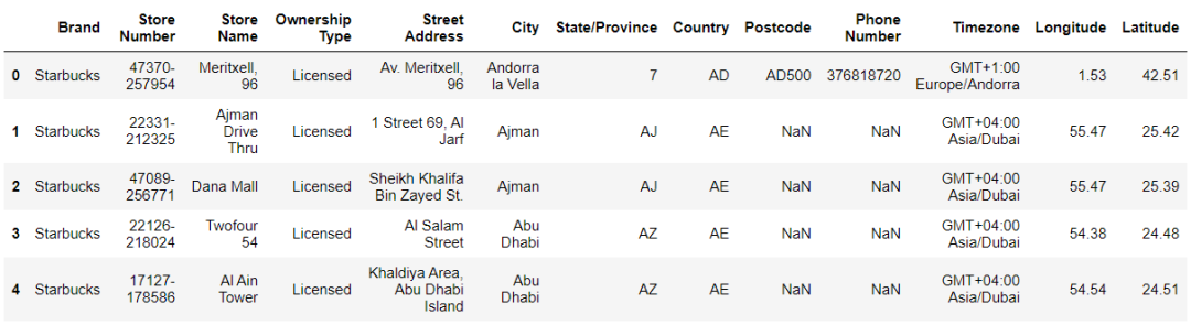
以星巴克門(mén)店在全球的分布為例�。本例數(shù)據(jù)來(lái)源Kaggle星巴克數(shù)據(jù):https://www.kaggle.com/starbucks/store-locations
數(shù)據(jù)樣例:
from pyecharts.charts import Map from pyecharts import options as opts from pyecharts.globals import ThemeType, CurrentConfig
CurrentConfig.ONLINE_HOST = 'C:/python/pyecharts-assets-master/assets/' df = starbuck['English']
data = df.value_counts()
datas = [(i, int(j)) for i, j in zip(data.index, data.values)] map_ = Map(init_opts=opts.InitOpts(theme=ThemeType.PURPLE_PASSION)) map_.add(series_name="門(mén)店數(shù)量", data_pair=datas, maptype="world") map_.set_series_opts(label_opts=opts.LabelOpts(is_show=False)) map_.set_global_opts(
title_opts=opts.TitleOpts(title="星巴克門(mén)店數(shù)量在全球分布",
pos_left='40%',
pos_top='10'), legend_opts=opts.LegendOpts(is_show=False),
visualmap_opts=opts.VisualMapOpts(
max_=13608,
min_=1,
is_piecewise=True,
pieces=[{"max": 9, "min": 1, "label": "1-9", "color": "#00FFFF"},
{"max": 99, "min": 10, "label": "10-99", "color": "#FF69B4"},
{"max": 499, "min": 100, "label": "100-499", "color": "#0000FF"},
{"max": 999, "min": 500, "label": "500-999", "color": "#00BFFF"},
{"max": 2000, "min": 1000, "label": "1000-2000", "color": "#228B22"},
{"max": 3000, "min": 2000, "label": "2000-3000", "color": "#FF0000"},
{"max": 20000, "min": 10000, "label": ">=10000", "color": "#FFD700"}
] )
) map_.render('星巴克門(mén)店在全球的分布.html')
輸出
繪圖步驟:
1、創(chuàng)建實(shí)例
Map(init_opts=opts.InitOpts(theme=ThemeType.PURPLE_PASSION))
創(chuàng)建實(shí)例并初始化配置�。
可配置圖表寬度、高度���、渲染風(fēng)格���、標(biāo)題、主題��、背景顏色等����,詳情參見(jiàn)下面連接
https://pyecharts.org/#/zh-cn/global_options?id=initopts:初始化配置項(xiàng)
theme: pyecharts內(nèi)置提供了10+ 種不同的風(fēng)格, 參見(jiàn)
https://pyecharts.org/#/zh-cn/themes
2、添加數(shù)據(jù)
.add()添加了數(shù)據(jù)�。
-
series_name: 系列名稱,用于 tooltip 的顯示����,legend 的圖例篩選��。
-
data_pair: 數(shù)據(jù)項(xiàng)��,每個(gè)數(shù)據(jù)項(xiàng)由一個(gè)個(gè)元組組成:(坐標(biāo)點(diǎn)名稱�,坐標(biāo)點(diǎn)值) 實(shí)際上一個(gè)是地區(qū)名稱另一個(gè)是對(duì)應(yīng)的數(shù)據(jù)�����。pyecharts繪制地圖只需導(dǎo)入城市名稱和數(shù)值即可�����,因?yàn)閰^(qū)縣級(jí)以上城市的經(jīng)緯度信息都已經(jīng)在模塊中存在�,可以在
https://github.com/pyecharts/pyecharts/blob/master/pyecharts/datasets/city_coordinates.json中找到。本實(shí)例中是國(guó)家名稱與門(mén)店數(shù)量組成的數(shù)據(jù)項(xiàng)����。[('United States', 13608),
('China', 2734), ('Canada', 1468), ('Japan', 1237), ... ]
-
maptype='world',這里是指地圖類(lèi)型�,默認(rèn)為china中國(guó)。地圖類(lèi)型請(qǐng)參見(jiàn):https://github.com/pyecharts/pyecharts/blob/master/pyecharts/datasets/map_filename.json
3�����、設(shè)置系列配置項(xiàng)
.set_series_opts()
https://pyecharts.org/#/zh-cn/series_options
除了在.add()中設(shè)置部分配置項(xiàng)外,就是使用.set_series_opts()配置圖元樣式�����、文字樣式���、標(biāo)簽樣式、點(diǎn)線樣式等�����。
4��、設(shè)置全局配置項(xiàng)
.set_global_opts() 配置標(biāo)題���、動(dòng)畫(huà)�����、坐標(biāo)軸��、圖例等�。
https://pyecharts.org/#/zh-cn/global_options
本實(shí)例中:
-
min_: 指定 visualMapPiecewise 組件的最小值�。
-
max_: 指定 visualMapPiecewise 組件的最大值��。
-
is_piecewise: 是否為分段型���。
-
pieces: 自定義的每一段的范圍,以及每一段的文字�,以及每一段的特別的樣式。
5���、生成的地圖以html格式保存
.render()將生成的地圖以html格式保存���。
二、Geo
Geo 圖類(lèi)型��,使用type_: str = "scatter" 參數(shù)控制�。
有 scatter, effectScatter, heatmap, lines4 種。
from pyecharts.globals import GeoType GeoType.GeoType.EFFECT_SCATTER�,GeoType.HEATMAP,GeoType.LINES
1��、動(dòng)態(tài)漣漪散點(diǎn)圖 effectScatter
V1 版本開(kāi)始支持鏈?zhǔn)秸{(diào)用��。
數(shù)據(jù)樣例:
import pandas as pd from pyecharts.globals import ThemeType, CurrentConfig, GeoType from pyecharts import options as opts from pyecharts.charts import Geo
CurrentConfig.ONLINE_HOST = 'C:/python/pyecharts-assets-master/assets/' df = pd.read_csv('directory2.csv', encoding='utf-8')['城市']
data = df.value_counts() datas = [(i, int(j)) for i, j in zip(data.index, data.values)]
print(datas)
geo = (Geo(init_opts=opts.InitOpts(width='1000px',
height='600px',
theme=ThemeType.PURPLE_PASSION),
is_ignore_nonexistent_coord = True)
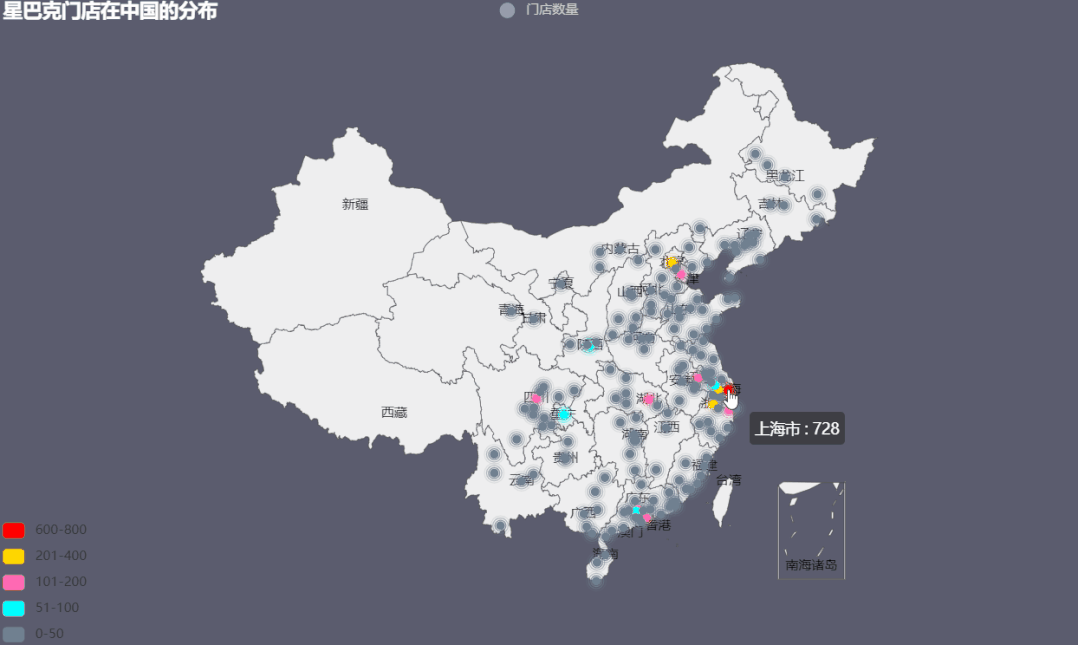
.add_schema(maptype='china',
label_opts=opts.LabelOpts(is_show=True)) .add('門(mén)店數(shù)量',
data_pair=datas,
type_=GeoType.EFFECT_SCATTER,
symbol_size=8,
)
.set_series_opts(label_opts=opts.LabelOpts(is_show=False))
.set_global_opts(
title_opts=opts.TitleOpts(title='星巴克門(mén)店在中國(guó)的分布'),
visualmap_opts=opts.VisualMapOpts(max_=550,
is_piecewise=True,
pieces=[
{"max": 50, "min": 0, "label": "0-50", "color": "#708090"},
{"max": 100, "min": 51, "label": "51-100", "color": "#00FFFF"},
{"max": 200, "min": 101, "label": "101-200", "color": "#FF69B4"},
{"max": 400, "min": 201, "label": "201-400", "color": "#FFD700"},
{"max": 800, "min": 600, "label": "600-800", "color": "#FF0000"},])
)
)
geo.render("星巴克門(mén)店在中國(guó)的分布.html")
輸出
Geo新增坐標(biāo)點(diǎn)# 新增一個(gè)坐標(biāo)點(diǎn)
.add_coordinate(
# 坐標(biāo)地點(diǎn)名稱
name: str,
# 經(jīng)度
longitude: Numeric,
# 緯度
latitude: Numeric, )
# 新增 json 文件格式的坐標(biāo)數(shù)據(jù)
.add_coordinate_json(
# json 文件格式的坐標(biāo)數(shù)據(jù)
# 格式如下
# {
# "阿城": [126.58, 45.32],
# "阿克蘇": [80.19, 41.09]
# }
json_file: str # 坐標(biāo)文件路徑
)
2����、熱力圖heatmapfrom pyecharts import options as opts
from pyecharts.charts import Geo
from pyecharts.globals import ChartType
CurrentConfig.ONLINE_HOST = 'C:/python/pyecharts-assets-master/assets/'
# pandas讀取csv文件數(shù)據(jù)
df = pd.read_csv('directory2.csv', encoding='utf-8')['城市']
data = df.value_counts()
datas = [(i, int(j)) for i, j in zip(data.index, data.values)]
print(datas)
geo = (
Geo(init_opts=opts.InitOpts(width='1000px',
height='600px',
theme=ThemeType.DARK),
is_ignore_nonexistent_coord=True)
.add_schema(maptype="china") #maptype選擇地圖種類(lèi)
.add(series_name="門(mén)店數(shù)量", # 系列名稱
data_pair=datas, # 數(shù)據(jù)項(xiàng) (坐標(biāo)點(diǎn)名稱�����,坐標(biāo)點(diǎn)值)
blur_size=20,
symbol_size= 5,
type_=ChartType.HEATMAP #類(lèi)型選為熱力圖
)
.set_series_opts(label_opts=opts.LabelOpts(is_show=False))
.set_global_opts(
visualmap_opts=opts.VisualMapOpts(max_=800,is_piecewise=True),
title_opts=opts.TitleOpts(title="星巴克門(mén)店在中國(guó)的分布熱力圖"))
)
geo.render( '星巴克門(mén)店在中國(guó)的分布熱力圖.html')
輸出
3�、動(dòng)態(tài)軌跡圖lines
pyecharts可以生成地理空間流動(dòng)圖���,用來(lái)表示航班數(shù)量���、人口流動(dòng)等等。
from pyecharts import options as opts from pyecharts.charts import Geo from pyecharts.faker import Faker from pyecharts.globals import ChartType, SymbolType, CurrentConfig import  random

datas = [] for _ in range(6):
    datas.append(tuple(random.sample(Faker.provinces, 2)))

CurrentConfig.ONLINE_HOST = 'C:/python/pyecharts-assets-master/assets/' geo = (
    Geo(init_opts=opts.InitOpts(width='1000px',
                                height='600px',
                                theme=ThemeType.CHALK))
    .add_schema(
        maptype="china",
        itemstyle_opts=opts.ItemStyleOpts(color="#323c48", border_color="#111"),
        label_opts=opts.LabelOpts(is_show=True)
    )
    .add(
        "",
        [list(z) for z in zip(Faker.provinces, Faker.values())],
        type_=ChartType.EFFECT_SCATTER,
        color="white",
    )
    .add(
        "出差",
        data_pair = datas,
        type_=ChartType.LINES,
        effect_opts=opts.EffectOpts(
            symbol=SymbolType.DIAMOND, symbol_size=6, color="blue"         ),
        linestyle_opts=opts.LineStyleOpts(curve=0.2),
    )
    .set_series_opts(label_opts=opts.LabelOpts(is_show=False))
    .set_global_opts(title_opts=opts.TitleOpts(title="動(dòng)態(tài)軌跡圖"))
    .render("動(dòng)態(tài)軌跡圖.html")
)
輸出
如果需要再添加一個(gè)其他類(lèi)別的動(dòng)態(tài)軌跡����,只需在鏈?zhǔn)街刑砑樱?/span>
.add('旅游',
[('上海','拉薩'),('拉薩','大理'),('大理','成都'),('成都','?�??)],
type_=ChartType.LINES,
effect_opts=opts.EffectOpts(
symbol=SymbolType.ARROW, symbol_size=6, color="orange"),
linestyle_opts=opts.LineStyleOpts(curve=0.5)
)
輸出如下����,可以點(diǎn)擊圖例來(lái)篩選類(lèi)別����。
這邊用到兩個(gè)配置項(xiàng):
-
effect_opts= opts.EffectOpts(symbol)漣漪特效配置項(xiàng)https://pyecharts.org/#/zh-cn/series_options?id=effectopts:漣漪特效配置項(xiàng)symbol: 特效圖形的標(biāo)記�。ECharts 提供的標(biāo)記類(lèi)型包括 'circle', 'rect', 'roundRect', 'triangle', diamond', 'pin', 'arrow', 'none',可以通過(guò) 'image://url' 設(shè)置為圖片�����,其中 URL 為圖片的鏈接����,或者 dataURI。
-
linestyle_opts=opts.LineStyleOpts(curve=0.2)線樣式配置項(xiàng)https://pyecharts.org/#/zh-cn/series_options?id=linestyleopts:線樣式配置項(xiàng)curve: 線的彎曲度�����,0 表示完全不彎曲�����。
4、三維地圖
from pyecharts import options as opts from pyecharts.charts import Map3D from pyecharts.globals import ChartType from pyecharts.commons.utils import JsCode
c = (
Map3D(init_opts=opts.InitOpts(width='1000px',
height='600px',
theme=ThemeType.VINTAGE))
.add_schema(
itemstyle_opts=opts.ItemStyleOpts( color="#00BFFF", opacity=1, border_width=0.8, border_color="#708090", ),
map3d_label=opts.Map3DLabelOpts(
is_show=False,
formatter=JsCode("function(data){return data.name + " " + data.value[2];}"),
),
emphasis_label_opts=opts.LabelOpts(
is_show=False,
color="#fff",
font_size=10,
background_color="rgba(0,23,11,0)",
),
light_opts=opts.Map3DLightOpts(
main_color="#fff",
main_intensity=1.2,
main_shadow_quality="high",
is_main_shadow=False,
main_beta=10,
ambient_intensity=0.3,
),
)
.add(
series_name="門(mén)店數(shù)量",
data_pair=datas,
type_=ChartType.BAR3D,
bar_size=1,
shading="lambert",
label_opts=opts.LabelOpts(
is_show=False,
formatter=JsCode("function(data){return data.name + ' ' + data.value[2];}"),
),
)
.set_global_opts(title_opts=opts.TitleOpts(title="星巴克門(mén)店在中國(guó)的分布3D圖"))
.render("map3d_with_bar3d.html")
)
輸出
本例中的主要參數(shù)說(shuō)明:
.add_schema()
地圖類(lèi)型設(shè)置,參考pyecharts.datasets.map_filenames.json 文件
-
itemstyle_opts=opts.ItemStyleOpts( ) 圖形的顏色
-
map3d_label=opts.Map3DLabelOpts() Map3D 的 Label 設(shè)置
-
emphasis_label_opts=opts.LabelOpts() 高亮標(biāo)簽配置項(xiàng)參考 series_options.LabelOpts
-
light_opts=opts.Map3DLightOpts() 光照相關(guān)的設(shè)置����。在 shading 為 'color' 的時(shí)候無(wú)效�。
.add()
-
type_=ChartType.BAR3D, 疊加圖的類(lèi)型(目前只支持Bar3D,Line3D����,Lines3D,Scatter3D)
-
shading="lambert"三維地圖中三維圖形的著色效果����。ECharts GL 中使用了基于物理的渲染(PBR)來(lái)表現(xiàn)真實(shí)感材質(zhì)。echarts-gl 中支持下面三種著色方式:color: 只顯示顏色�����,不受光照等其它因素的影響。
lambert: 通過(guò)經(jīng)典的 lambert 著色表現(xiàn)光照帶來(lái)的明暗�。
realistic: 真實(shí)感渲染,配合 light.ambientCubemap 和 postEffect 使用可以讓展示的畫(huà)面效果和質(zhì)感有質(zhì)的提升�。
5、Globe地圖
數(shù)據(jù)來(lái)源是pyecharts自帶的全球人口數(shù)據(jù)��。
import pyecharts.options as opts from pyecharts.charts import MapGlobe from pyecharts.faker import POPULATION from pyecharts.globals import ThemeType

data = [x for _, x in POPULATION[1:]]
low, high = min(data), max(data)

c = (
    MapGlobe(init_opts=opts.InitOpts(theme=ThemeType.DARK))
    .add_schema()
    .add(
        maptype="world",
        series_name="World Population",
        data_pair=POPULATION[1:],
        is_map_symbol_show=False,
        label_opts=opts.LabelOpts(is_show=False),
    )
    .set_global_opts(
        visualmap_opts=opts.VisualMapOpts(
            min_=low,
            max_=high,
            range_text=["max", "min"],
            is_calculable=True,
            range_color=["lightskyblue", "yellow", "orangered"],
        )
    )
    .render("map_globe_base.html")
)
輸出
本文到此結(jié)束�����,總體來(lái)說(shuō)Pyecharts地圖繪圖還是比較友好��,在不需要多么炫酷的配置前提下�,只需要將輸入數(shù)據(jù)格式和類(lèi)型弄清楚�����,其余默認(rèn)配置即可����。
對(duì)地圖樣式有一定要求時(shí)�,只需要根據(jù)官網(wǎng)上的配置信息調(diào)整全局配置項(xiàng)和系列配置項(xiàng)即可����。
CDA數(shù)據(jù)分析師考試相關(guān)入口一覽(建議收藏):
? 想報(bào)名CDA認(rèn)證考試���,點(diǎn)擊>>>
“CDA報(bào)名”
了解CDA考試詳情��;
? 想學(xué)習(xí)CDA考試教材,點(diǎn)擊>>> “CDA教材” 了解CDA考試詳情�;
? 想加入CDA考試題庫(kù)�����,點(diǎn)擊>>> “CDA題庫(kù)” 了解CDA考試詳情�����;
? 想了解CDA考試含金量�,點(diǎn)擊>>> “CDA含金量” 了解CDA考試詳情��;


 京公網(wǎng)安備 11010802034615號(hào)
經(jīng)營(yíng)許可證編號(hào):京B2-20210330
京公網(wǎng)安備 11010802034615號(hào)
經(jīng)營(yíng)許可證編號(hào):京B2-20210330