
CDA數(shù)據(jù)分析研究院原創(chuàng)作品,轉(zhuǎn)載需授權(quán)
小編總是被那些玩轉(zhuǎn)數(shù)據(jù)����、利用數(shù)據(jù)做出超炫酷圖表的大佬深深折服,膝蓋都不夠給他們���。進(jìn)行數(shù)據(jù)可視化做出超炫圖表的軟件有很多�,今天小編也用數(shù)據(jù)分析常用的python來演示一下如何做出精彩的數(shù)據(jù)可視化呈現(xiàn)���。
導(dǎo)入相關(guān)的庫(kù)和加載數(shù)據(jù)
import numpy as np
import pandas as pd
import seaborn as sns
import matplotlib.pyplot as plt
from datetime import date, timedelta, datetime
設(shè)置路徑和加載數(shù)據(jù)
小編使用的是一個(gè)記錄美國(guó)1908年到2009年飛機(jī)出事和死亡乘客記錄的數(shù)據(jù)���。
import os
os.chdir(r'D:\data\air_data')
Data=pd.read_csv('airplane.csv')
查看各列有沒有缺失值:
Data.isnull().sum()
對(duì)缺失數(shù)據(jù)進(jìn)行清洗:
Data['Time'] = Data['Time'].replace(np.nan, '00:00')
Data['Time'] = Data['Time'].str.replace('c: ', '')
Data['Time'] = Data['Time'].str.replace('c:', '')
Data['Time'] = Data['Time'].str.replace('c', '')
Data['Time'] = Data['Time'].str.replace('12\'20', '12:20')
Data['Time'] = Data['Time'].str.replace('18.40', '18:40')
Data['Time'] = Data['Time'].str.replace('0943', '09:43')
Data['Time'] = Data['Time'].str.replace('22\'08', '22:08')
Data['Time'] = Data['Time'].str.replace('114:20', '00:00')
Data['Time'] = Data['Date'] + ' ' + Data['Time']
return datetime.strptime(x, '%m/%d/%Y %H:%M')
Data['Time'] = Data['Time'].apply(todate)
print('Date ranges from ' + str(Data.Time.min()) + ' to ' + str(Data.Time.max()))
Data.Operator = Data.Operator.str.upper()

數(shù)據(jù)可視化
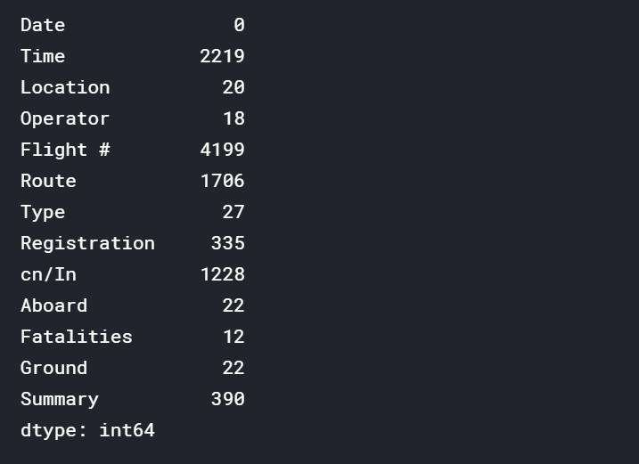
繪制1908年到2009年飛機(jī)出事頻數(shù)的折線圖,大概得出一個(gè)趨勢(shì)變化�����。
Temp = Data.groupby(Data.Time.dt.year)[['Date']].count()
Temp = Temp.rename(columns={"Date": "Count"})
plt.figure(figsize=(12,6))
plt.style.use('bmh')
plt.plot(Temp.index, 'Count', data=Temp, color='blue', marker = ".", linewidth=1)
plt.xlabel('Year', fontsize=10)
plt.ylabel('Count', fontsize=10)
plt.title('Count of accidents by Year', loc='Center', fontsize=14)
plt.show()
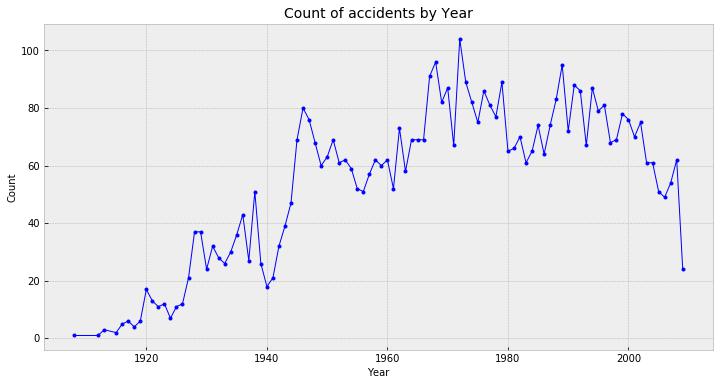
我們把時(shí)間再精細(xì)化點(diǎn),觀察每月����,每個(gè)星期�����,甚至每小時(shí)的事故����,這次我們不看趨勢(shì),看量��,繪制條形圖����。
import matplotlib.pylab as pl
import matplotlib.gridspec as gridspec
gs = gridspec.GridSpec(2, 2)
pl.figure(figsize=(15,10))
plt.style.use('seaborn-muted')
ax = pl.subplot(gs[0, :]) # row 0, col 0
sns.barplot(Data.groupby(Data.Time.dt.month)[['Date']].count().index, 'Date', data=Data.groupby(Data.Time.dt.month)[['Date']].count(), color='lightskyblue', linewidth=2)
plt.xticks(Data.groupby(Data.Time.dt.month)[['Date']].count().index, ['Jan', 'Feb', 'Mar', 'Apr', 'May', 'Jun', 'Jul', 'Aug', 'Sep', 'Oct', 'Nov', 'Dec'])
plt.xlabel('Month', fontsize=10)
plt.ylabel('Count', fontsize=10)
plt.title('Count of accidents by Month', loc='Center', fontsize=14)
ax = pl.subplot(gs[1, 0])
sns.barplot(Data.groupby(Data.Time.dt.weekday)[['Date']].count().index, 'Date', data=Data.groupby(Data.Time.dt.weekday)[['Date']].count(), color='lightskyblue', linewidth=2)
plt.xticks(Data.groupby(Data.Time.dt.weekday)[['Date']].count().index, ['Mon', 'Tue', 'Wed', 'Thu', 'Fri', 'Sat', 'Sun'])
plt.xlabel('Day of Week', fontsize=10)
plt.ylabel('Count', fontsize=10)
plt.title('Count of accidents by Day of Week', loc='Center', fontsize=14)
ax = pl.subplot(gs[1, 1])
sns.barplot(Data[Data.Time.dt.hour != 0].groupby(Data.Time.dt.hour)[['Date']].count().index, 'Date', data=Data[Data.Time.dt.hour != 0].groupby(Data.Time.dt.hour)[['Date']].count(),color ='lightskyblue', linewidth=2)
plt.xlabel('Hour', fontsize=10)
plt.ylabel('Count', fontsize=10)
plt.title('Count of accidents by Hour', loc='Center', fontsize=14)
plt.tight_layout()
plt.show()
出事時(shí),每年登機(jī)人數(shù)與死亡人數(shù)的對(duì)比圖
Fatalities = Data.groupby(Data.Time.dt.year).sum()
Fatalities['Proportion'] = Fatalities['Fatalities'] / Fatalities['Aboard']
plt.figure(figsize=(15,6))
plt.subplot(1, 2, 1)
plt.fill_between(Fatalities.index, 'Aboard', data=Fatalities, color="skyblue", alpha=0.2)
plt.plot(Fatalities.index, 'Aboard', data=Fatalities, marker = ".", color="Slateblue", alpha=0.6, linewidth=1)
plt.fill_between(Fatalities.index, 'Fatalities', data=Fatalities, color="olive", alpha=0.2)
plt.plot(Fatalities.index, 'Fatalities', data=Fatalities, color="olive", marker = ".", alpha=0.6, linewidth=1)
plt.legend(fontsize=10)
plt.xlabel('Year', fontsize=10)
plt.ylabel('Amount of people', fontsize=10)
plt.title('Total number of people involved by Year', loc='Center', fontsize=14)
plt.subplot(1, 2, 2)
plt.plot(Fatalities.index, 'Proportion', data=Fatalities, marker = ".", color = 'red', linewidth=1)
plt.xlabel('Year', fontsize=10)
plt.ylabel('Ratio', fontsize=10)
plt.title('Fatalities / Total Ratio by Year', loc='Center', fontsize=14)
plt.tight_layout()
plt.show()
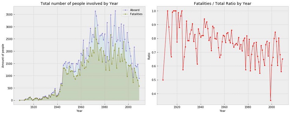
通過對(duì)比圖我們可以看到死亡人數(shù)變得如此之高(即使在90年代后似乎有下降的趨勢(shì))����。一些人提出了一個(gè)很好的觀點(diǎn),那就是圖表并沒有顯示每年所有航班發(fā)生事故的比例����。因此,1970-1990年在空中交通信號(hào)燈的歷史上看起來是可怕的一年,死亡人數(shù)上升����,但也有可能是乘飛機(jī)的總?cè)藬?shù)上升,而實(shí)際上比例下降了�����。
親愛的筒子們��,想了解更多用python玩轉(zhuǎn)數(shù)據(jù)�����、掌握炫酷可視化技能那就趕緊關(guān)注CDA數(shù)據(jù)分析師微信公眾號(hào)(cdacdacda)吧�,點(diǎn)贊、轉(zhuǎn)發(fā)����、收藏,更多干貨內(nèi)容呈現(xiàn)給你噢����。

CDA數(shù)據(jù)分析師考試相關(guān)入口一覽(建議收藏):
? 想報(bào)名CDA認(rèn)證考試,點(diǎn)擊>>>
“CDA報(bào)名”
了解CDA考試詳情���;
? 想學(xué)習(xí)CDA考試教材����,點(diǎn)擊>>> “CDA教材” 了解CDA考試詳情;
? 想加入CDA考試題庫(kù)��,點(diǎn)擊>>> “CDA題庫(kù)” 了解CDA考試詳情���;
? 想了解CDA考試含金量,點(diǎn)擊>>> “CDA含金量” 了解CDA考試詳情�����;


 京公網(wǎng)安備 11010802034615號(hào)
經(jīng)營(yíng)許可證編號(hào):京B2-20210330
京公網(wǎng)安備 11010802034615號(hào)
經(jīng)營(yíng)許可證編號(hào):京B2-20210330