R語言基礎(chǔ)畫圖/繪圖/作圖
R語言基礎(chǔ)畫圖
R語言免費且開源�����,其強大和自由的畫圖功能,深受廣大學生和可視化工作人員喜愛����,這篇文章對如何使用R語言作基本的圖形����,如直方圖�,點圖,餅狀圖以及箱線圖進行簡單介紹�����。
0 結(jié)構(gòu)
每種圖形構(gòu)成一個section�,每個部分大致三部分構(gòu)成�,分別是R語言標準畫圖代碼����,R語言畫圖實例��,和畫圖結(jié)果�。
R語言標準畫圖代碼幫助你可以直接使用:help(funciton)查找�,實例數(shù)據(jù)基本都來自內(nèi)置包的數(shù)據(jù),好了����,直接切入主圖,從最簡單的點圖開始吧����。
1 點圖
點圖��,簡單的講就是每個數(shù)據(jù)點按照其對應的橫縱坐標位置對應在坐標系中的圖形�,什么是點圖就不做過多介紹了���。
點圖標準代碼:
dotchart(x, labels = NULL, groups = NULL, gdata = NULL,
cex = par("cex"), pt.cex = cex,
pch = 21, gpch = 21, bg = par("bg"),
color = par("fg"), gcolor = par("fg"), lcolor = "gray",
xlim = range(x[is.finite(x)]),
main = NULL, xlab = NULL, ylab = NULL, ...)
x是數(shù)據(jù)來源�����,也就是要作圖的數(shù)據(jù)����;labels
是數(shù)據(jù)標簽��,groups分組或分類方式��,gdata分組的值����,cex字體大小,pch是作圖線條類型�,bg背景�,color顏色���,xlim橫坐標范圍��,main是圖形標題����,xlab橫坐標標簽��,相應的ylab是縱坐標���。
-實例
eg1.1:
dotchart(mtcars$mpg,labels = row.names(mtcars),cex = .7,
main = "Gas Mileage for Car Models",
xlab = "Miles Per gallon")
mtcar是內(nèi)置包中的一個數(shù)據(jù)����,將mtcar中每加侖油的里程(mpg,miles per
gallon)作為要描述的對象����,用點圖展現(xiàn)出來���,將行名作為點圖標簽���,字體大小是正常大小的0.7��,標題“Gas Mileage for Car
Models”���,x軸標簽”Miles Per gallon”����。
運行結(jié)果(run 或者Ctrl + Enter快捷鍵)如圖所示:
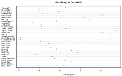
散點圖1.1
eg1.2:
現(xiàn)在覺得這個圖太散亂了,希望這個圖能夠經(jīng)過排序���,想要按照油缸數(shù)(cyl)進行分組并且用不同的顏顯示����。(注:#是R語言中的行注釋�����,并且只有行注釋�,運行時系統(tǒng)會自動跳過#后面的內(nèi)容)
x <- mtcars[order(mtcars$mpg),] #按照mpg排序
x$cyl <-factor(x$cyl) #將cyl變成因子數(shù)據(jù)結(jié)構(gòu)類型
x$color[x$cyl==4] <-"red" #新建一個color變量,油缸數(shù)cyl不同����,顏色不同
x$color[x$cyl==6] <-"blue"
x$color[x$cyl==8] <-"darkgreen"
dotchart(x$mpg, #數(shù)據(jù)對象
labels = row.names(x), #標簽
cex = .7,#字體大小
groups = x$cyl, #按照cyl分組
gcolor = "black", #分組顏色
color = x$color, #數(shù)據(jù)點顏色
pch = 19,#點類型
main = "Gas Mileage for car modes \n grouped by cylinder", #標題
xlab = "miles per gallon") #x軸標簽
run后結(jié)果如下:
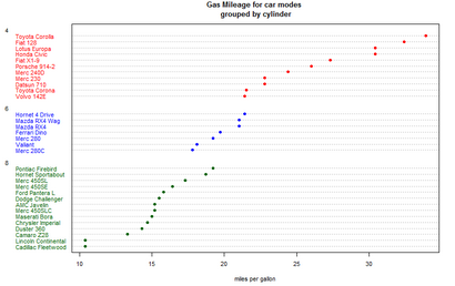
散點圖1.2
是不是好看多了�,嘻嘻!按照油缸數(shù)不同進行了分類�����,并且可以看出油缸數(shù)量越多越耗油。
2 直方圖
2.1 直方圖
小學生都知道的條形圖�,怎么弄?
條形圖標準代碼:
barplot(height, ...)
是太簡單了嗎�����?這么粗暴����,就給了一個變量。
實例
eg2.1.1
library(vcd)
counts <- table(Arthritis$Improved) #引入vcd包只是想要Arthritis中的數(shù)據(jù)
barplot(counts,main = "bar plot",xlab = "improved",ylab = "counts")
結(jié)果2.1.1:
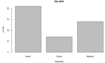
條形圖2.1.1
barplot(counts,main = " horizontal bar plot",
xlab = "frequency",
ylab = "improved",
horiz = TRUE)#horizon 值默認是FALSE���,為TRUE的時候表示圖形變?yōu)樗降?
圖形結(jié)果:
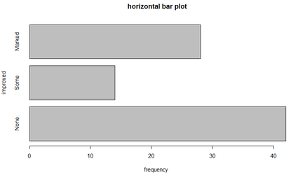
條形圖2.1.2
eg2.1.3 進階
數(shù)據(jù)來源:vcd包中的Arthritis��,風濕性關(guān)節(jié)炎研究結(jié)果數(shù)據(jù)���,如果沒有安裝vcd包,需要先安裝��,install.packages("vcd")���,然后用library引用包vcd��,
install.packages("vcd")
library(vcd)
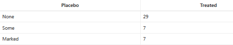
counts <- table(Arthritis$Improved,Arthritis$Treatment)
counts
數(shù)據(jù)如下所示:
代碼:
eg 2.1.3.1
barplot(counts,main = " stacked bar plot",xlab = "treated",ylab = "frequency",
col = c("red","yellow","green"), #設(shè)置顏色
legend = rownames(counts)) #設(shè)置圖例
結(jié)果2.1.3.1:
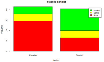
2.1.3.1堆砌條形圖
代碼
eg2.1.3.2

結(jié)果2.1.3.2
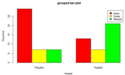
分組條形圖2.1.3.2
請注意����,兩幅圖的區(qū)別在于2.1.3.2設(shè)置了beside = TRUE,beside默認值是FALSE�,繪圖結(jié)果是堆砌條形圖,beside值為TRUE時����,結(jié)果是分組條形圖。
2.2**荊棘圖**
荊棘圖是對堆砌條形圖的擴展���,每個條形圖高度都是1���,因此高度就表示其比例。
- 實例
代碼
library(vcd)
attach(Arthritis)
counts <- table (Treatment,Improved)
spine(counts,main = "Spinogram Example")
detach(Arthritis)
結(jié)果:
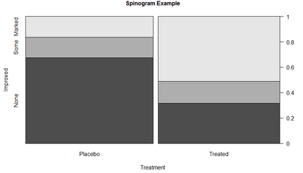
荊棘圖2.2
3 直方圖
直方圖標準代碼:
hist(x, ...)
也是簡單地可以哈��?
- 實例
我們使用par設(shè)置圖形參數(shù)���,用mfrow將四幅圖放在一起��。
代碼
eg3.1:
par (mfrow = c(2,2)) #設(shè)置四幅圖片一起顯示
hist(mtcars$mpg) #基本直方圖
hist(mtcars$mpg,
breaks = 12, #指定組數(shù)
col= "red", #指定顏色
xlab = "Miles per Gallon",
main = "colored histogram with 12 bins")
hist(mtcars$mpg,
freq = FALSE, #表示不按照頻數(shù)繪圖
breaks = 12,
col = "red",
xlab = "Miles per Gallon",
main = "Histogram,rug plot,density curve")
rug(jitter(mtcars$mpg)) #添加軸須圖
lines(density(mtcars$mpg),col= "blue",lwd=2) #添加密度曲線
x <-mtcars$mpg
h <-hist(x,breaks = 12,
col = "red",
xlab = "Miles per Gallon",
main = "Histogram with normal and box")
xfit <- seq(min(x),max(x),length=40)
yfit <-dnorm(xfit,mean = mean(x),sd=sd(x))
yfit <- yfit *diff(h$mids[1:2])*length(x)
lines(xfit,yfit,col="blue",lwd=2) #添加正太分布密度曲線
box() #添加方框
結(jié)果:
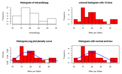
直方圖3.1
4 餅圖
標準餅圖代碼:
pie(x, labels = names(x), edges = 200, radius = 0.8,
clockwise = FALSE, init.angle = if(clockwise) 90 else 0,
density = NULL, angle = 45, col = NULL, border = NULL,
lty = NULL, main = NULL, ...)
實例
eg4.1
par(mfrow = c(2,2))
slices <- c(10,12,4,16,8) #數(shù)據(jù)
lbls <- c("US","UK","Australis","Germany","France") #標簽數(shù)據(jù)
pie(slices,lbls) #基本餅圖
pct <- round(slices/sum(slices)*100) #數(shù)據(jù)比例
lbls2 <- paste(lbls," ",pct ,"%",sep = "")
pie(slices,labels = lbls2,col = rainbow(length(lbls2)), #rainbow是一個彩虹色調(diào)色板
main = "Pie Chart with Percentages")
library(plotrix)
pie3D(slices,labels=lbls,explode=0.1,main="3D pie chart") #三維餅圖
mytable <- table (state.region)
lbls3 <- paste(names(mytable),"\n",mytable,sep = "")
pie(mytable,labels = lbls3,
main = "pie chart from a table \n (with sample sizes")
結(jié)果:
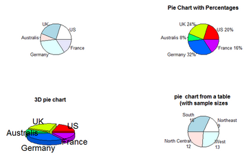
4.1 餅狀圖
5 箱線圖5.1 箱線圖
標準箱線圖代碼:
boxplot(x, ...)
實例
eg5.1boxplot(mtcars$mpg,main="Box plot",ylab ="Miles per Gallon") #標準箱線圖
boxplot(mpg ~ cyl,data= mtcars,
main="car milesge data",
xlab= "Number of cylinders",
ylab= "Miles per Gallon")
boxplot(mpg ~ cyl,data= mtcars,
notch=TRUE, #含有凹槽的箱線圖
varwidth = TRUE, #寬度和樣本大小成正比
col= "red",
main="car milesge data",
xlab= "Number of cylinders",
ylab= "Miles per Gallon")
mtcars$cyl.f<- factor(mtcars$cyl, #轉(zhuǎn)換成因子結(jié)構(gòu)
levels= c(4,6,8),
labels = c("4","6","8"))
mtcars$am.f <- factor(mtcars$am,levels = c(0,1),
labels = c("auto","standard"))
boxplot(mpg~ am.f*cyl.f, #分組的箱線圖
data = mtcars,
varwidth=TRUE,
col= c("gold","darkgreen"),
main= "MPG Distribution by Auto Type",
xlab="Auto Type",
ylxb="Miles per Gallon")
結(jié)果:
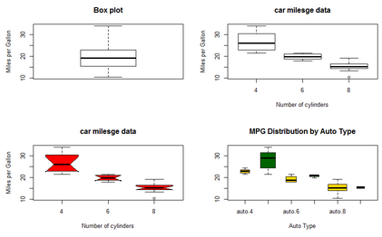
5.1 箱線圖
5.2 小提琴圖
小提琴圖是箱線圖和密度圖的結(jié)合��。使用vioplot包中的vioplot函數(shù)進行繪圖。
小提琴圖標準代碼:
vioplot( x, ..., range=1.5, h, ylim, names, horizontal=FALSE,
col="magenta", border="black", lty=1, lwd=1, rectCol="black",
colMed="white", pchMed=19, at, add=FALSE, wex=1,
drawRect=TRUE)
實例
代碼:
eg5.2
library(vioplot)
x1 <- mtcars$mpg[mtcars$cyl==4]
x2 <- mtcars$mpg[mtcars$cyl==6]
x3 <- mtcars$mpg[mtcars$cyl==8]
vioplot(x1,x2,x3,names= c("4 cyl","6 cyl","8 cyl"),col = "gold")
title(main="Violin plots of Miles Per Gallon",xlab = "number of cylinders",ylab = "Miles per gallon")
結(jié)果:
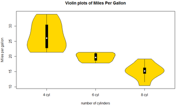
5.2 小提琴圖
白點是中位數(shù)���,中間細線表示須���,粗線對應上下四分位點���,外部形狀是其分布核密度。
CDA數(shù)據(jù)分析師考試相關(guān)入口一覽(建議收藏):
? 想報名CDA認證考試�����,點擊>>>
“CDA報名”
了解CDA考試詳情���;
? 想學習CDA考試教材��,點擊>>> “CDA教材” 了解CDA考試詳情����;
? 想加入CDA考試題庫�����,點擊>>> “CDA題庫” 了解CDA考試詳情��;
? 想了解CDA考試含金量,點擊>>> “CDA含金量” 了解CDA考試詳情�;


 京公網(wǎng)安備 11010802034615號
經(jīng)營許可證編號:京B2-20210330
京公網(wǎng)安備 11010802034615號
經(jīng)營許可證編號:京B2-20210330